Learning Matplotlib
Matplotlib is a powerful Python library for creating static, animated, and interactive visualizations. It provides a flexible and intuitive way to generate a wide range of plots, from simple line charts to complex 3D visualizations. Matplotlib is widely used in data science, engineering, and research to explore and communicate insights from data. 📊
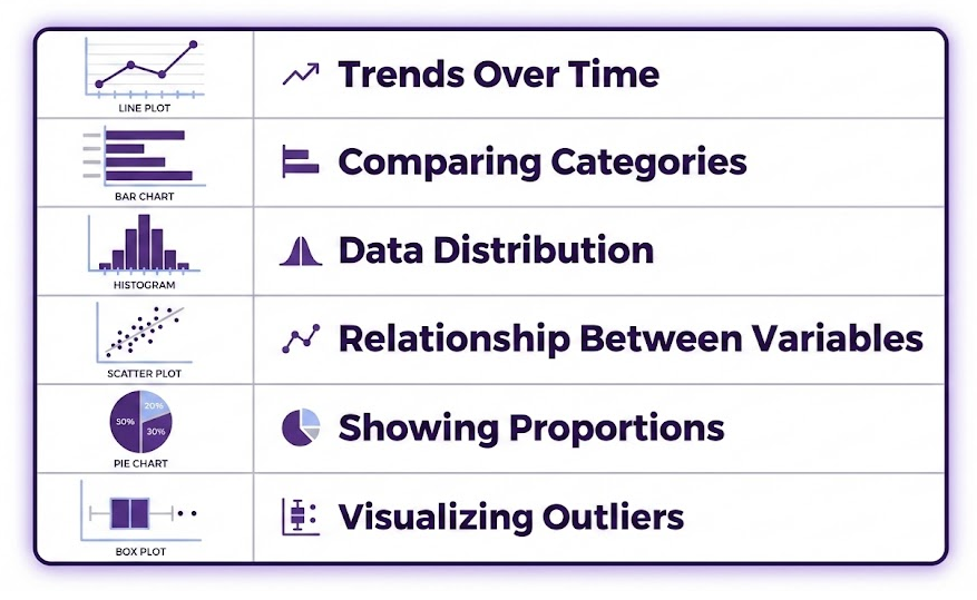
Matplotlib supports a variety of chart types to help visualize different kinds of data for different purposes:
You can explore a wide range of examples in the Matplotlib Chart Gallery. 🎨
💡 Why Data Visualization Matters
Data visualization is a crucial step in data analysis. It allows us to:
✅ Identify patterns and trends that might be hidden in raw numbers.
✅ Communicate insights clearly to stakeholders, making complex data more understandable.
✅ Detect outliers and anomalies that could impact decision-making.
✅ Validate models and hypotheses by visually comparing predicted and actual data.
By mastering Matplotlib, you gain the ability to present data in a compelling way, making it easier to analyze and share your findings. 🚀
Here’s how to create each plot individually first using normal Matplotlib, and then an example that uses fig, axes = plt.subplots(1, 2) to display them side by side.
📊 Bar Charts
A bar chart is useful for comparing categorical data, such as the average rainfall per city. In this example we’ll use the bar chart helps compare the average rainfall per city.
Steps:
1. Read the dataset and group the data by city.
2. Compute the mean rainfall for each city, handling missing values appropriately.
3. Plot a bar chart to show the mean rainfall by city.
Click on the “Run Code” button to see chart.
When creating a bar chart in Matplotlib using plt.bar(), we need two key pieces of data:
- Categories (x-axis labels) – These are typically strings, such as city names.
- Values (y-axis data) – These are numerical values associated with each category, such as average rainfall.
In our example:
plt.bar(mean_rainfall.index, mean_rainfall.values, color='skyblue')mean_rainfall.indexprovides the city names (City A, City B, City C).mean_rainfall.valuesprovides the mean rainfall values (11.25, 5.6, 0.0).- The
color='skyblue'argument sets the bar color.
Matplotlib allows customization using several options. Below are key settings we applied:
🎨 Title, Labels, and Grid
plt.title("Mean Rainfall by City")  # Set the title
plt.xlabel("City")  # Label for the x-axis
plt.ylabel("Rainfall (mm)")  # Label for the y-axis
plt.grid(axis='y', linestyle='--', alpha=0.7)  # Optional: add a light grid for readability
✅ plt.title() helps describe the chart.
✅ plt.xlabel() and plt.ylabel() label each axis.
✅ plt.grid(axis='y', linestyle='--', alpha=0.7) adds a dashed grid for better readability.
📈 Multi-Time Series Charts
A multi-time series chart visualizes rainfall trends per city.
Click on the “Run Code” button to see chart.
🔀 Side-by-Side Display Using fig, axes
To compare both charts in a single figure, we use fig, axes = plt.subplots(1, 2), creating two side-by-side subplots.
Click on the “Run Code” button to see the charts.
🔧 Explanation of fig, axes = plt.subplots(1, 2)
✅ fig, axes = plt.subplots(1, 2, figsize=(12, 5)) creates one row with two side-by-side subplots.
✅ axes[0] contains the bar chart.
✅ axes[1] contains the multi-time series chart.
✅ plt.tight_layout() ensures spacing is optimized.
This allows direct visual comparison of average rainfall vs. time-series trends side-by-side. 📊
🎯 Summary
Matplotlib is one of the most widely used Python libraries for data visualization. It allows users to create clear, customizable, and professional-looking plots to explore, analyze, and communicate insights from data. With Matplotlib, you can generate a wide range of visualizations, from basic charts (bar, line, scatter) to more advanced plots (heatmaps, histograms and boxplots).
Now that you understand the basics of Matplotlib, consider exploring:
- 📌 The Matplotlib Documentation for more advanced techniques.
- 📌 The Chart Gallery for inspiration on different types of visualizations.
With strong visualization skills, you can turn raw data into valuable insights and make better decisions! 🚀 Happy plotting! 🎨📊
🚀 Ready to Collaborate with AI
Now that you understand Pandas and Matplotlib basics, you’re equipped to collaborate effectively with AI. This foundation means you can evaluate, debug, and modify AI-generated code—rather than blindly copying it. 🤝