Data Science Prompting Examples
This section provides practical examples of how to prompt AI for common data science tasks. This certainly doesn’t cover all use-cases, and it is important for you to explore how AI can be used yourself.
💡 AI-Assisted Learning and Debugging Examples
| Category | Example Prompt |
|---|---|
| 📖 Code Explanation | “Act as a senior data analyst. Can you explain this pandas function and what each part does? [Insert code]” |
| 🐛 Debugging and Troubleshooting | “Act as a Python debugging expert. This function is supposed to normalize my dataset, but it throws an error. Please help debug it. [Insert function]” |
| 🎓 Concept Learning | “Act as a data science mentor. What is the difference between groupby() and pivot_table() in pandas? Provide examples.” |
| ✅ Code Review and Optimization | “Act as a professional Python developer. Review my pandas code for cleaning this dataset and suggest improvements. [Insert code]” |
🔍 Researching Analysis Approaches
Before writing code, you often need to decide how to approach your data analysis problem. LLMs can help you explore different methods and techniques within the tools you’re already using.
Exploring Analysis Methods
LLMs can suggest different ways to approach a data analysis problem using Pandas and Matplotlib. Click each topic to see example prompts and AI responses:
Great question! There are three main approaches you can use for handling missing data in Pandas:
1. Drop missing values - Use df.dropna() when you have minimal missing data (less than 5%) and it’s randomly distributed. It’s simple but you’ll lose some information.
2. Fill with mean/median - Use df.fillna(df.mean()) for numerical data. This preserves your sample size but can reduce variance in your dataset.
df.fillna(method='ffill') for time series where values change gradually. It’s good for temporal patterns but be careful as it can propagate errors.
It depends on what you want to emphasize! Here’s a quick breakdown:
Bar chart - Best for comparing totals across regions in a single time period. It’s simple and clear, but limited to showing one metric at a time.
Grouped bar chart - Perfect for comparing multiple categories (like quarters) across regions. Makes it easy to compare both within and between groups.
Stacked bar chart - Great for showing part-to-whole relationships, like product categories within each region. It’s space-efficient but can be harder to compare middle segments precisely.There are three common statistical approaches you can use for outlier detection:
IQR method - This flags values beyond Q1 - 1.5×IQR or Q3 + 1.5×IQR. It’s robust to extreme values and works well with skewed data.
Z-score method - This identifies values more than 2-3 standard deviations from the mean. It works best for normally distributed data, but keep in mind it’s sensitive to existing outliers.
Percentile method - This removes a fixed percentage of extreme values (like bottom 1% and top 1%). It’s flexible and distribution-agnostic, though the cutoff can feel somewhat arbitrary.There are two main approaches for time-based aggregation in Pandas:
resample() method - Use df.resample('M').sum() when you have a DatetimeIndex. It’s built specifically for time series, handles missing periods automatically, and supports both upsampling and downsampling.
groupby() method - Use df.groupby(df['date'].dt.to_period('M')).sum() for more flexibility. It works with any column and allows multiple grouping variables, but requires manual date extraction.
Understanding Pandas and Matplotlib Options
As you’ve learned, Pandas and Matplotlib have many methods and parameters. LLMs can help you understand when to use different approaches:
These two methods serve different purposes:
.loc[] - Label-based selection - Use this when you know row/column names or want to filter by conditions. It works with boolean masks and includes endpoints in slices. For example: df.loc[df['age'] > 30, 'name':'salary']
.iloc[] - Position-based selection - Use this when you want to select by integer position, like array indexing. It excludes endpoints in slices and is position-independent of labels. For example: df.iloc[0:5, -2:]
They convey different visual messages for time series data:
Line plot - Use plt.plot() for continuous time series with regular intervals. It implies continuity between points and shows trends clearly. Best for daily sales, temperature readings, or other connected sequential data.
Scatter plot - Use plt.scatter() for irregular time series or individual observations. It shows discrete points without implying connection. Best for sparse data, irregular intervals, or when you want to emphasize individual measurements.
plt.plot(dates, values, 'o-') to show both individual points and connections when you want to emphasize both aspects.
There are three main approaches for combining DataFrames in Pandas:
merge() - SQL-style joins - Use pd.merge(df1, df2, on='key') for combining based on common columns. It supports inner, outer, left, and right joins. This is best when you have related data with a common key.
join() - Index-based merge - Use df1.join(df2) for combining using DataFrame indexes. It’s essentially a shortcut for merging on indexes. Best when your DataFrames have meaningful indexes to align on.
pd.concat([df1, df2]) for stacking vertically (rows) or horizontally (columns). This works best for combining data with the same structure, like monthly reports.
Most libraries offer multiple ways to solve the same problem. Instead of memorizing one approach, use LLMs to explore alternatives and understand the trade-offs. You’ll develop better judgment about which method fits your situation—and that’s a skill that sticks.
🚀 AI-Assisted Coding Examples
Once you have a solid grasp of the fundamentals, LLMs can accelerate coding tasks across the data analysis lifecycle. Below are examples of AI-assisted coding for real-world Python applications using Pandas and Matplotlib:
| Category | Example Prompt |
|---|---|
| 📥 Data Loading | “Act as a data scientist. Please generate Python code to load a CSV file into a pandas DataFrame and display the first five rows.” |
| 🧹 Data Cleaning | “Act as a data wrangling expert. I have missing values in ‘age’ and ‘income’ columns. Please generate pandas code to handle them.” |
| 🔎 Data Exploration | “Act as a data analyst. Given a dataset of customer transactions, write pandas code to generate summary statistics and detect outliers.” |
| 🔄 Data Wrangling | “Act as a data transformation expert. Please generate pandas code to pivot a DataFrame, aggregating sales data by region and month.” |
| 📈 Charting | “Act as a visualization expert. Please generate Python code to visualize sales trends over time using Matplotlib, including a line plot with rolling averages.” |
🎯 Practical Workflow Examples
Here are complete examples showing how to prompt for common data science workflows:
“You are an experienced data analyst. I have a CSV file called ‘customer_data.csv’ with columns: customer_id, age, income, purchase_amount, region.
Please write Python code using Pandas to:
1. Load the data and show basic info (shape, data types, first 5 rows)
2. Check for missing values and duplicates
3. Calculate summary statistics for numerical columns
4. Show the distribution of customers by region
Use clear comments explaining each step.”“Act as a data preprocessing expert. I need to clean a sales dataset with these issues:
- Missing values in ‘sales_amount’ column
- Inconsistent date formats in ‘transaction_date’
- Outliers in ‘quantity’ column (some negative values)
- Duplicate customer records
Write Pandas code that:
1. Handles missing sales amounts by filling with median
2. Standardizes dates to YYYY-MM-DD format
3. Removes negative quantities and caps extreme values using IQR method
4. Removes duplicate customers keeping the most recent record
Include validation steps to confirm the cleaning worked.”“You are a data visualization specialist. Using Matplotlib and the cleaned sales data:
Create a dashboard with 3 subplots:
1. Line chart showing monthly sales trends over time
2. Bar chart comparing sales by product category
3. Scatter plot of quantity vs sales_amount with trend line
Use a professional color scheme, proper labels, and a main title. Make the figure size 15x10 inches for presentation.”“Act as a data generation expert. I need to create a realistic dummy dataset for testing my sales analysis code.
Please generate Python code using Pandas to create a CSV file with:
- 1000 rows of customer transaction data
- Columns: customer_id, date, product_category, sales_amount, quantity, region
- Realistic data patterns:
- Sales amounts between $10-$500 with some seasonal variation
- 5 product categories: Electronics, Clothing, Books, Home, Sports
- 4 regions: North, South, East, West
- Dates spanning 2 years (2022-2023)
- Some missing values (5% in sales_amount, 2% in quantity)
- Include weekend/weekday sales patterns
Make the data realistic enough to test data cleaning, aggregation, and visualization functions. Save as ‘dummy_sales_data.csv’ and show the first few rows.”📊 Analyzing Data from Visual Sources
You’ll encounter data insights presented as graphs or charts that may not be immediately obvious why certain trends exist. AI can help you interpret visual data and suggest analysis approaches.
You can prompt AI questions such as the following: Identify Patterns:
- “What trends and patterns do you see in this time series?”
- “Are there any outliers or anomalies that need investigation?”
- “What does the seasonality suggest about the underlying process?”
Suggest Analysis Methods:
- “What statistical tests would help validate these apparent trends?”
- “How would you quantify the relationship between these variables?”
- “What forecasting approach would work best for this data pattern?”
Generate Analysis Code:
- “Write Python code to recreate this analysis using pandas and matplotlib”
- “How would I calculate the key metrics shown in this visualization?”
- “Create code to identify the peak periods and growth rates from this data”
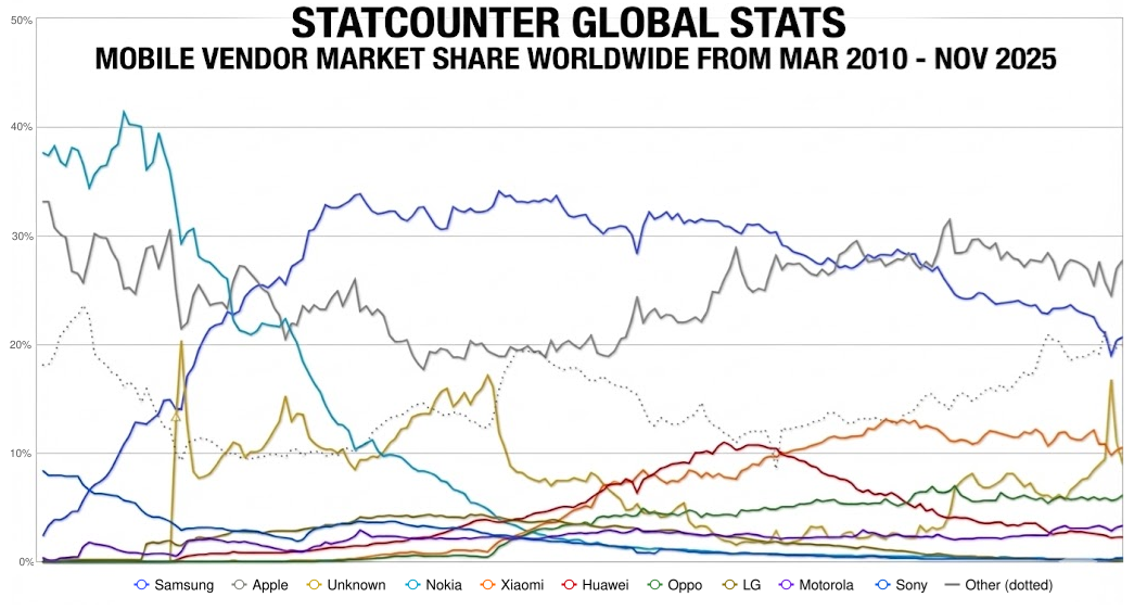
Here’s what I can see from this mobile marketshare data:
1. The Disruption Era (2010–2013)
The Fall of Nokia: Starting at a dominant ~40%, Nokia (light blue line) experiences a near-vertical collapse, dropping below 5% by 2014.
The Rise of Samsung: Samsung (dark blue line) mirrors this collapse in reverse, skyrocketing from under 10% to become the market leader (~33%) by early 2013.
2. The Duopoly & Seasonal Volatility (2014–2020)
Samsung vs. Apple: This period is defined by a consistent “tug-of-war” between the dark blue (Samsung) and grey (Apple) lines.
Apple’s Cyclical Spikes: Notice the sharp, recurring peaks in the Apple line every Q4/Q1. These are product launch cycles, where Apple briefly overtakes or narrows the gap with Samsung before receding.
3. The Chinese Expansion & Market Fragmentation (2020–2025)
The “Other” Contraction: The dotted grey line (“Other”) has significantly declined as the market consolidates into 5–6 major players.
Emergence of Challengers: Brands like Xiaomi (orange), Huawei (red), and Oppo (green) show steady growth starting around 2018. Xiaomi specifically has established a firm “third place” position, effectively squeezing the market share of the top two.🎯 Key Takeaway
LLMs are valuable assistants in understanding, debugging, and generating code—but your expertise remains essential. Remember to always validate AI outputs and build your fundamentals.
The examples above show how to apply the prompting techniques from previous sections to real data science work. Practice with these patterns and adapt them to your specific analysis needs.